SOLUTION
Designed to be a flexible all-day Asian eating house, the venue had to allow for counter-side lunches and tapas style sharing, late night whisky/sake bar and cocktails. The brand was a response to the brief ‘must be fun, loud and cheeky, and designed for the curious minded.’ Inspired by retro 80-90’s American-Japanese-Korean pop culture, eating houses and hawker stalls, the menus, uniforms, environmental graphics and way-finding were carefully curated to be sensitive to the interiors, so the customer journey through Lazy Su was to ‘discover first, ask questions later’.
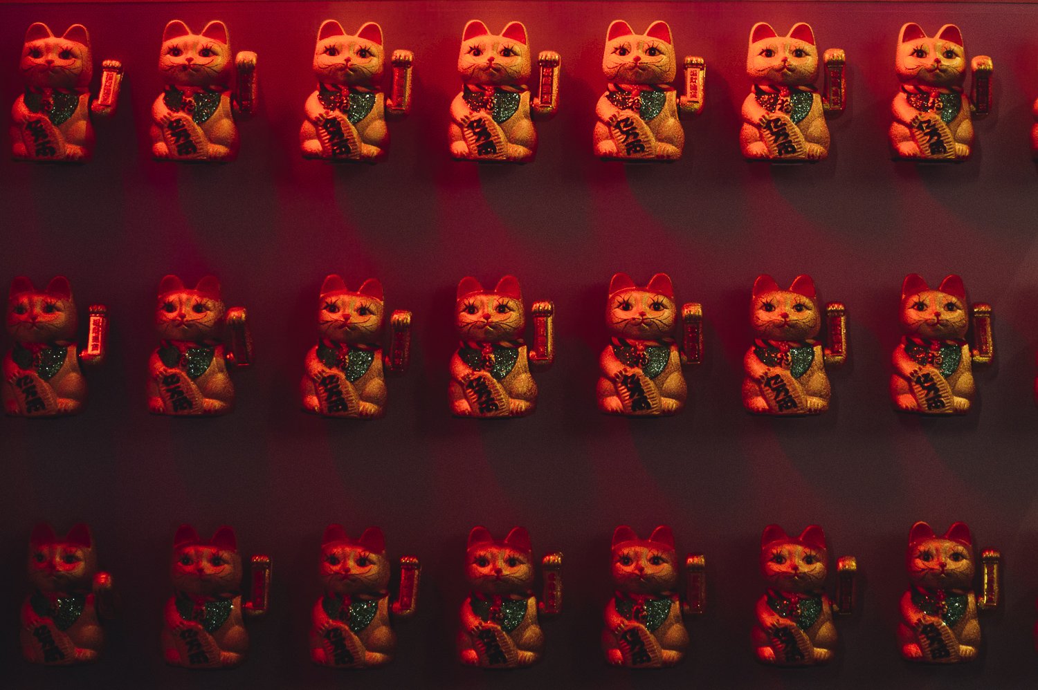
Each area was designated an ‘activation’, from the main entry to the signature bar, counter dining and booth seating. A range of materials from natural wood panels and batons, exposed brickwork, concrete sheeting, lenticular mirrors and hand painted denim cloth are inspired by travel through Japan, with neon, LED backlighting, 3D-text light boxes and paper lanterns all adding to the vibe. Each activation was designed to be both ‘instagrammable’ and highly functional. For instance the unique tetris style lighting feature over the bar which doubles as a drinks menu.


