OUTCOME
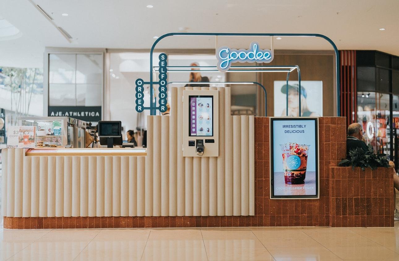
Brick, timber, and micro-cement—these natural and authentic finishes wrap the architectural silhouette of Goodee, exuding values of genuineness. The aim is to embody the essence of fresh, nurturing food through its hardwearing materials and earthy yet energetic colours.
Brand anchoring is threaded through the illuminated vertical frames, powder-coated in Goodee's iconic teal green, with pops of acai purple, sky blue, and warm yellows on the custom-illustrated perforated panels. The upper two-thirds of the kiosk facade is wrapped in fluted micro-cement, giving a sense of suspended lightness to the otherwise solid design.
Taking advantage of the full-round kiosk, all the corners were maximised to its customer journey potential. From ordering and pick-up areas to standing and sitting dining areas, as well as being mindful of creating the invisible sightline boundaries of the back-of-house preparation area. The layout was being optimised to operate as efficiently and conveniently as possible for the customers and the staff.
Indulge in healthy and delicious choices in a space designed for a health-conscious community and elevated by nature finesse.


